If we cast aside the songs, which years gave us the best show? We're taking into account every aspect of presentation, with particular attention being paid to set-design. Here are our findings:
| 1pt - 1973,
Luxembourg |
|
 |
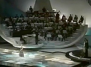
The sound this year may have
been terrible (with the strings barely audible), and the modern font
they chose for the graphics was rather hard work, but the set was ok,
with the orchestra arranged in galleries across the back of the stage.
The acts pass through the doorway to the left of the main
gallery-section, past a model of the grand prix medal. Raised platforms
of concentric circular panels dot the stage which is draped in flora.
Voting was of the Blankety-Blank style. |
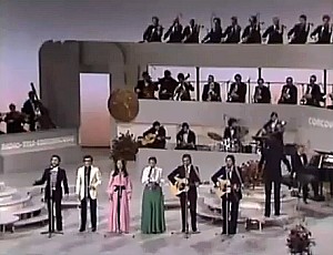
| 2pts - 1957,
Germany |
|
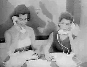 |
The rules and format of the
competition as we know it were largely laid down in 1957. The set
itself was nothing special: just some white drapery and some steps. But
the presentation as a whole created the template for all that followed.
The voting is a particular highlight, with in-vision telephones and a
rather fetching map of Europe (complete with flashing lights). |
| 3pts - 1982,
United Kingdom |
|
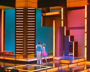 |
1982's a strange one. We open
with a loosened up version of Charpentier, complete with drums, then
the Eurovision logo spins and we're faced with the question "Where is
Harrogate?" before being thrown into proceedings properly with the
fusion stylings of Ronnie Hazlehurst. The scoreboard's a classy backlit
thing, while the stage is a lightbox-seamed geometric delight (the
basic colours of which can be varied). Then the back wall opens up to
reveal our host, Jan Leeming, in her curious alien head-dress. In
captions, act names are tripled for added comic effect (eg. MESS MESS
MESS). |
| 4pts -
1978, France |
|
 |
The palette of the 1978 contest
is very brown; the colour very muted. There's a haze akin to the
smoke-filled ambiance of a Working Man's Club. All of which serves to
obscure the woefully muted light-box dancefloor. Hard to miss though is
the giant swiveling salad bowl that holds the orchestra. A better
feature of this contest appears between songs, as we follow the next
act on a backstage journey that involves, of all things, a lift ride.
Once at the right floor there's a tag-team exchange with the previous
act before taking to the stage. This novelty is one of the more
memorable features of 1978, but also worthy of comment is the Thomas
Crown Affair / Grand Prix -style split-screen gimmick in use during the
voting, allowing us to simultaneously see the scoreboard, the
presenters, and the green room. |
| 5pts - 1979, Israel |
|
 |
There's the novelty of
trilingual presentation, and the post-cards are hammily acted cartoon
caricatures of each nation. It's not all
painful though. There's a rather fetching sculpture at the back of the
stage, based on the IBA logo, which assumes a different configuration
during the opening bars of each song (animated backdrops being a
gimmick originated by Roland De Groot for the 1970 contest). |
| 6pts - 1963,
United Kingdom |
|
 |
Broadcast from two studios at
BBC Television Centre, one housing the audience, scoreboard and the
delectable Katie Boyle, the other housing a range of different
backdrops for our detached performers. Their songs are captured by
invisible boom-mics and their performances are exquisitely directed.
The result is more a series of studio-performance promo films than the
usual concert atmosphere, which makes 1963 a most unusual year but a
strangely beautiful one. That Katie Boyle is so compelling as a host
only adds to the charm. |
| 7pts - 1965,
Italy |
|
 |
A very boring stage design, the
backdrop being simply the Eurovision logo. But the bar-chart scoreboard
is amazing; really amazing; a triumph of design. Our presenter, Renata
Mauro, is pretty good too, as is an entertaining opening to the
contest, performed on the organ that is seen in the background during
the voting process. |
| 8pts - 1980,
Netherlands |
|
 |
Third place, and we meet our
first Roland de Groot set of this list: the frightening face thing.
It's made up of several motor-controlled light boxes that can be
positioned anywhere across the backdrop but which nine times out of ten
end up arranged to look like some sort of frightening face thing. The
opening of the contest sees a transient beachcomber whistling
Charpentier, while the closing titles roll to a funky brass number
before ending on a bookend scene in which the winning act is shown
walking along the same beach whistling our beloved Te Deum, graced by a
James Bond style "Till we meet again in Ireland" caption (and
iris-wiped to black). One assumes that every act made such a film and
that somewhere there's a reel with José Cid whistling, and "Till
we meet again in Portugal" emblazoned over it. |
| 10pts - 1976,
Netherlands |
|
 |
There are some cheap elements to
the 1976 contest: the scoreboard looks like a café menu with
plug-in lettering, and the credits are on chroma-keyed cards being
clearly swapped by hand (Subterranean Homesick Blues style). There are
points of interest like the Protect-and-Survive -ish graphics, the
water-feature, and host Cory Brokken looking a bit like Dustin Hoffman.
And then there's Roland de Groot's stage backdrops. Depicted left are
the 18 backdrops that appeared behind the 18 songs in the '76 contest. |
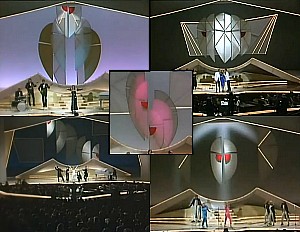
| 12pts - 1984,
Luxembourg |
|
 |
The scoreboard may have a horrid
font, and the polyglot presenter may be a little too slick, but
everything else about 1984 is just beautiful. Even the postcards,
cheesy as they are, with a mime-troupe of jobbing actors and the odd
bit of computery graphics, are inventive and novel. But again,
unsurprisingly, it is Roland de Groot who makes 1984 a work of
tear-jerking beauty. It took 26 people to operate the array of
suspended light-boxes (each box apparently equipped with eight shades
of lighting) and is supposed to have cost ƒ300,000 (≈ £125,000 in
1984 terms or c.£300,000 allowing for inflation). How that
compares to other years is a question for you to research in your own
time. After the contest it went on to a new life as part of the set for
the Dutch version of 3-2-1 (these tit-bits of info courtesy of [[http://beeldengeluidwiki.nl]]).
Depicted left are the 21 backdrops used to illustrate the 19 songs, the
introduction and the encore (click on the array to see it in double the
resolution). The closing credits of the contest are particularly
moving: the set disassembling in line with the title-roll, as a medley
of Luxembourg winners plays over before exploding into a particularly
bombastic Charpentier. |
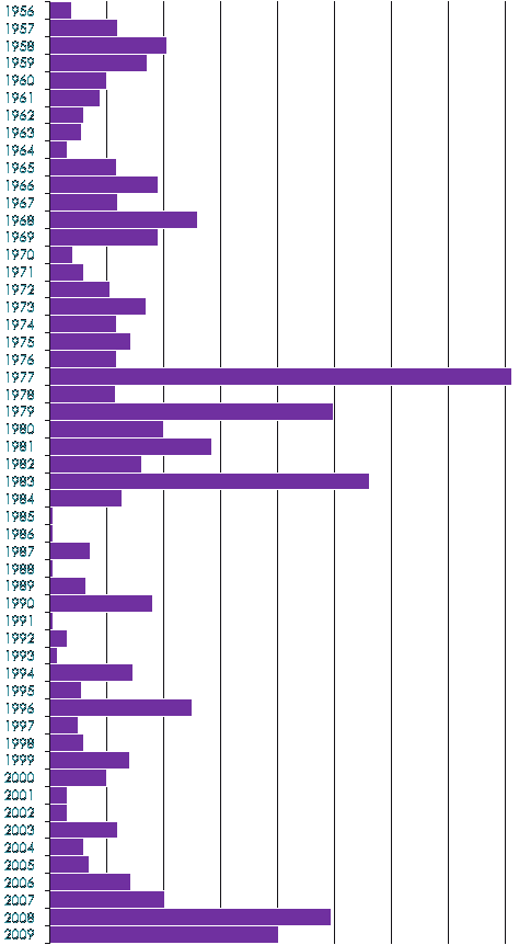
What if we don't cast aside the songs? Well we feel that the 10 Best Songs lists give a fairly decent indication in that regard, as do the reports that make up the main body of this site. But we've also provided the following graph which attempts to gauge each contest based on its performance in the charts that we've made for the site (an elaborate formula was devised, naturally, incorporating various tables we produced en route to establishing our 10 Best Songs lists). It's by no means perfect (the peaks in the '90s probably ought not to out-tower the troughs in the '60s and '70s) but the gist is there. It gives a reasonably accurate impression of the respective merits of each year, and certainly goes some way to indicating those contests that we believe were particularly strong.